
Thursday, 29 November 2012

Close-ups of magazine advert nearly finished
1. The picture below shows our finalized magazine advert.
You can see the title "Dreamscape" in capitals at the very top.
Just under the title "Dreamscape" is our artist's name, Sally Cassello.
We also said when it was out and put reviews on
it as well as saying where it was available at.
It also has a copyright symbol on the bottom right-hand corner.

2. The picture below shows a close up of the information we put on our finalized magazine advert.

3. Below shows the magazine advert being edited on the left. Below on the right is our finalized digi-pack.
The reason I took a picture of these to side by side like this, is to show how we used one image for a digi-pack and used it for our magazine advert as well. As research has shown that professionally they do use one image they have on a digi-pack for their magazine advert, with slight differences. Our difference on the magazine advert was that the picture of the pathway wasn't extended going towards the edges like on the digi-pack, and stays central on the magazine advert.

We decided that we still needed to have a drop shadow to make the words stand out more. This is what we are going to do next lesson.


Copyright
You need to have holder's permission to copy their products otherwise you could go to jail.
Made-up tracks for our digi-pack with Human
Made-up tracks to go on the back cover of our digi-pack as well as their track time,
how long they play for.
1. Human - 4:13
2. Cloudy Days - 3:15
3. Feather Fantasies - 2:10
4. Twilight - 3:00
5. Hallucination - 4:00
6. Get together - 4:37
7. Sweet Anniversary - 5:02
§9. Moonlight Gaze - 3:21
10. Daydream Delirium - 4:42
11. Walking to Heaven - 3:07
12. Lost Love - 6:02
Copyright
All CDs and DVDs have copyright on them. This essentially means that you cannot copy and redistribute a licensed product if you do that would be an infringement of the copyright law and is classed as piracy. On average 95% of the downloaded music is pirated meaning that musicians only recieve 5% of what they should earn, menaing that they have to go on tours to earn back some of the money that they lose in music sales.
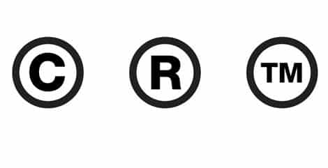
If you see the copyright sign it means that the product is licensed and therefore cannot be copied. It can also come in the form of R or TM meaning Registered Trade Mark.

If you see the copyright sign it means that the product is licensed and therefore cannot be copied. It can also come in the form of R or TM meaning Registered Trade Mark.
More magazine advert research
There seems to be a link between the CD cover and the actual magazine advert. The pros of this could be that the audience would identify with it more. It is also cheaper to produce as you'd already have the images.
Any information found on the spine of a digi-pack?
As a group we never really thought about having a design on the spine of our digi-pack as we either thought we would have six different images fitted into the digi-pack template that was already on the desktop on a college mac computer. Even when we changed our idea to having two images that were going to be stretched over three folds of the digi-pack each. We didn't think about the spine. We just knew that when we changed our idea of the design of the digi-pack. We wanted one image on the inside stretched all the way to fit. Then have the image on top of the disc as well. This is so that it felt continuous. Whilst the other image was stretched along the back with the tracks on the back cover, and the title on the front cover.
My research has shown that on the spine of a digi-pack has the artist or bands name.
My research has shown that on the spine of a digi-pack has the artist or bands name.
Music distribution
Looking into music distribution, the most effective way of distributing and selling a CD is through the internet. Research has shown people refer it more to buying the actual CD as it's quick and easy to download and it isn't much hassle. People who buy the CD worry they will loose it however buying it online, it's forever on your iTunes account (if you choose to buy though iTunes). However, there are still a majority of people who buy the actual CD as they feel they are contributing more to their artist and supporting them, having the actual CD gives a sense of possession in a franchise.
Magazine advert
For our magazine advert, we have decided to go for something simple. It'll be the front cover of our digipack as a poster with details of when the album is out and where to buy it. I think the ad works well as the poster draws the attention of the audience because of the dark to light gradient, the eyes are first drawn to the top of the poster, with the title of "Dreamscape", to the bottom of the poster where it shows what it's about.

Copyright
Copyright is a legal concept act done by most governments, giving the creator of their original work rights to it. Anybody can enable copyright by simply putting the symbol next to their work. No-one else is allowed to copy or distribute the product without permission from the work's creator.
Wednesday, 28 November 2012
Update: Magazine Advert
As well as the Digipak, we need to create a magazine advert. The conventional theme of a magazine advert is for the advert to have links to the album or single it is advertising for example:


These 2 examples both use the same designs for their album covers as their advert. This helps to get the look of the album cover stuck into people's heads. For example if you see the Green Day advert you will remember the hand holding a heart shaped grenade so you will look for a hand holding a heart shaped grenade for a cd cover.
The Disturbed advert is using the cd cover but with added background texture and much more textual information about the release date and band details.
In other designs there are cd covers and adverts with different images used. I think this isn't as effective as using the same image for both, it may seem to be advertising 2 different products when they are advertising the same one. For example: 50 Cent's Get Rich Or Die Tryin' cd cover and advert:
CD Cover: Advert:


In our advert we shall be using the same image as one of the digipak images, maybe adjusting the colours slightly. We will be using one of Alyssa's Photoshop drawings of the blue sky with clouds and a white path leading off into the distance. For the CD cover we will be using this image as well as 2 very similar to get the feeling of the image is continuing. We will be using another of Alyssa's Photoshop drawings for the otherside, this image is of a sunset with silhouetted buildings. Again to fill out the other 2 panels we have used 2 of the same sort of image for the added effect.
We still need to add the information such as tracknames, the name of the album (Dreamscape) and other technical information about the DVD such as aspect ratio and run time. For the tracknames we can make them up but we will have to give them links to dreamy atmospheres and to fit the genre.
In our current draft of the advert we have included shops and websites for where to buy the album, this is conventional for album covers. We may also include reviews from existing or fictional reviewing companies and the date of release.
CD Cover: Advert:


These 2 examples both use the same designs for their album covers as their advert. This helps to get the look of the album cover stuck into people's heads. For example if you see the Green Day advert you will remember the hand holding a heart shaped grenade so you will look for a hand holding a heart shaped grenade for a cd cover.
The Disturbed advert is using the cd cover but with added background texture and much more textual information about the release date and band details.
In other designs there are cd covers and adverts with different images used. I think this isn't as effective as using the same image for both, it may seem to be advertising 2 different products when they are advertising the same one. For example: 50 Cent's Get Rich Or Die Tryin' cd cover and advert:
CD Cover: Advert:


In our advert we shall be using the same image as one of the digipak images, maybe adjusting the colours slightly. We will be using one of Alyssa's Photoshop drawings of the blue sky with clouds and a white path leading off into the distance. For the CD cover we will be using this image as well as 2 very similar to get the feeling of the image is continuing. We will be using another of Alyssa's Photoshop drawings for the otherside, this image is of a sunset with silhouetted buildings. Again to fill out the other 2 panels we have used 2 of the same sort of image for the added effect.
We still need to add the information such as tracknames, the name of the album (Dreamscape) and other technical information about the DVD such as aspect ratio and run time. For the tracknames we can make them up but we will have to give them links to dreamy atmospheres and to fit the genre.
In our current draft of the advert we have included shops and websites for where to buy the album, this is conventional for album covers. We may also include reviews from existing or fictional reviewing companies and the date of release.
Digipack update
 This is the finished product, drawing wise. We will add the text and title later. We decided to stretch out the two images and have them have different colour schemes, dark and light, the clash gives it more of an abstract feel. I made the images simple but enough detail to draw attention to it.
Extra digi-pack content
The digi-pack that we are making, has to be a special edition digi-pack. This means we need to put in extra content for our target audience. This is also a way of trying to get people in our target audience to pay more than a normal digi-pack due to it's extra content. However I've found two images which show their extra content which are trying to seduce their target audiences to pay extra money for the bonuses they've put in.


Above shows that there are "three bonus tracks released only in the CD" above including the fourteen tracks that are already on there. Another way they've tried to seduce their people buying the special edition digi-pack is by having a "free postcard". If you digitally download it it "includes immediate download of Autumn Stories in your choice of MP3320, FLAC or just about any other format you could possibly desire."
Above shows that the bonuses are "a free bottle opener" and "includes five bonus tracks".
Our additional content would be the music video we've made on a DVD.
More fonts
In today's lesson we were looking at more possible fonts that could be on our digi-pack.

3.

- Above shows that our title is in a font called Scribble. It looks nice and elegant but maybe depending on the size we need our title. Some people may not be able to read it.
- Above shows that our title is in a font called Spitter. We thought it was a nice handwriting look, although it was a bit too thin.
3.
- Above shows that our title is in a font called Khand. It looks similar to 2. (Spitter), but thicker.
14th reflection - our magazine advert
In today's lesson we are trying to put two pictures into the digi-pack template and re-arranging them accordingly. However in the end we decided one of the pictures was better for the magazine advert.
We also still haven't decided on the fonts to use in our digi-pack. This means that we are still looking at fonts to use.


We also still haven't decided on the fonts to use in our digi-pack. This means that we are still looking at fonts to use.
Above shows that we finally made a start on the magazine advert. It also shows at the bottom how to get the album from; iTunes, amazon and HMV. In the bottom right hand corner it shows that you could follow us on Twitter and Facebook. What we still need to add according to the checklist we need to have on a magazine advert are review stars and saying if it is out now or later on.
Also in the lesson we found out that there was an already made digi-pack with the title "Dreamscape" on it. This was as our teacher had found it whilst she was showing us examples of digi-packs to help us make sure we put the same detail as the professional digi-packs have on ours.
After I looked on Google I found a couple of images with "Dreamscape" on and they led to how to download the artists/bands tracks.
Above doesn't show their digi-pack. However it shows that you can buy the tracks online. The image that has "dreamscape" on it is very abstract. The image also looks hand drawn, or drawn with software but looks like it was done by hand, just like our image for our magazine advert.
Above shows that the artist is "Dreamscape" and they have a very abstract image, but different to how the one above it (the drawn looking one). It also shows that the genre is different as out genre is indie / pop / folk because this is the genre Ellie Goulding is. In the Drawn looking picture it also mentions indie as a genre as well as rock and alternative. This suggests that dreamy themed digi-packs are more conventional in the indie genre.
Copyright
Distribution of music videos research
This link shows you how to upload a music video to iTunes using TubeCore.


Tuesday, 27 November 2012
Digipack full draft
This is an idea that I came up with. The digipack will have 6 sides, one with the CD, one with the song lyrics, another with CD contents etc. The white and black squiggles represent writing, just to give an idea of what the actual digipack would look like as this is just the basic sketch. I will draw more pictures for the digipack, I changed the colour of the images and copy and pasted them to again give an idea of the final product. The photos of the artist will be stylized and in cartoon, not actual photos as it might clash with the pictures, however, judging from the pictures, if the photos had a simple background, it would probably fit with the drawings.

Second digipack picture
This is another digipack drawing I did. Still trying to keep in theme with the "dreamscape", the name of the album we have chosen. The pictures are going to be surreal.

Magazine adverts research

To the left shows an example of 30 Seconds To Mars, which is a mixed genre band. Their genres include alternative rock, hard rock, emo and progressive metal.
This magazine advert has no image of the band on their magazine advert. This goes against the Goodwin's point about selling the artist/band. However the way that they sell their band is by having the special triangle with a line through it, which is placed underneath the black square with writing in it, and with red text over it.

To the right shows an example of Ellie Goulding's magazine advert. Her genre is indie/folk/pop. It follows the convention by having an image of the artist.
This example of a magazine advert has more detail for example "Lights #1 UK album chart debut" and "BBC sound of 2010 award winner". This is an example of selling the artist, through her successes. Also selling the artist by having a mid-close up image of the artist.
Below shows an example of Lily Allen's magazine adverts. Her genres are pop, ska, reggae fusion, electropop. Unlike in Ellie Goulding's exmaple of a magazine advert I've found above, the picture of Lily Allen is placed on the far right with the information about her song "The Fear" and her "forthcoming album" to her left. Where as in Ellie Goulding's one, Ellie Goulding is placed in the centre of her magazine advert, with all her information is placed in the middle as well. However above and below her face on the image, so you can see her face clearly.

Magazine advert research
This is a magazine ad that Cat found of one of Ellie Goulding's Light album. It shows details of the album like what will be in it, awards that it has won and where to buy it. It shows the awards and debuts that it has gotten, this has been done to appeal more to the audience and show them that this album will turn out to be really good if they do buy it. The poster is composed so that the eyes are first drawn to the image of Goulding in the middle and slowly works it's way down the text, the award and debut information coming first.
Star persona
We decided our star persona is going to be an artist called Sally Casselo. However, we were unsure at first as we used Alyssa as an actress for the lip syncing and Cat as our other actress for the rest of the music video. We have a facebook page for Sally Casselo but we have decided to change the picture to Alyssa. By using Alyssa as our face for the lip syncing, the audience will automatically think she is the star persona.
The USP will be the lyrics and the music video. The digipack won't have the face of Sally as she will focus more on her songs and her lyrics and the message she tries to convey in them. Many artists USP is their face, their image and how they look. It's a good way of identifying the artist but it's something that we have chosen not to do.
www.facebook.com/pages/Sally-Cassello/116281735195811
Monday, 26 November 2012


13th reflection
In today's lesson we were looking at a variety of different fonts for our title. We decided to go for a font looks quite dreamy and slightly curly. We didn't want it too curly so you couldn't read it. We also looked at ones that looked handwritten and bubble writing. These are a few examples of ones I've looked at. I think the ones that are more suited for our title out of these five examples are; example one - Vtks Beautiful Dreams which is a calligraphy script. Example two Beyond Wonderland - which has curls coming off of the writing 'Dreamscape' which we decided our title was going to be.


http://www.fonts2u.com/category.html?id=26
We've also looked on google for some dreamy like pictures as inspiration for our digi-pack.
http://www.fonts2u.com/category.html?id=26
We've also looked on google for some dreamy like pictures as inspiration for our digi-pack.
Star Persona
We have a facebook page for our artist Sally Casello.
However at the moment we have an image of someone else instead of Alyssa our lip-syncing actress.
To get to the actual page the picture is showing;

We still need to change the picture of Sally Cassello to a picture of Alyssa, as this would be more appropriate. As Alyssa is our lip-syncing actress. Also in the music video our beach actress Cat (me), you do not see her face. It would baffle people who'd watch the video and then go to this page where the link takes you to see a picture of another person, and not the person who was lip-syncing in the music video.
This is the picture we are going to change the profile picture of Sally Cassello's to.
(Below).

Sunday, 25 November 2012
Update - Digipak
For the Digipak we have to design 6 sides of a CD album
cover and create a magazine cover.
 We have taken a test shoot featuring Alyssa as the singer,
we took shots of her in a wooded area e.g. under trees next to bushes in an
autumn scene. We also took some shots of leaves that have fallen on the floor
and some wet tree bark to use as a texture background for other parts of the cover.
I think we should aim to give the CD cover a naturalistic and pure look.
We have taken a test shoot featuring Alyssa as the singer,
we took shots of her in a wooded area e.g. under trees next to bushes in an
autumn scene. We also took some shots of leaves that have fallen on the floor
and some wet tree bark to use as a texture background for other parts of the cover.
I think we should aim to give the CD cover a naturalistic and pure look.

For the Digipak we have to design all 6 of the sides using
photos and pictures of people and objects relating to the album. The Digipak
has to be made to look like an album CD cover not just a single. This means we
cannot have it all as a beach which just represents our song, it needs to
represent many songs that Sally Cassello has sung, these songs can be made up
but need to fit the genre and star persona of her.
Here is a possible design for a 6 panel digipak that we may use:

This is a photo of an Ellie Goulding 4 sided digipak:Here is a possible design for a 6 panel digipak that we may use:
For our track list, Alyssa came up with the idea of having a
side on drawing of a girl’s face with the tracks printed below the nose on the
other side of the page. She will create these pictures on Photoshop, but we are
not sure if she should do a self portrait of herself as the actress or of
another girl’s face.
Here is a digipak that is focused around drawings or photoshop drawings:
What I think we could do is have a side dedicated to our
song ‘Human’ as a number 1 hit, we could use a photo of a beach with Cat
standing in the dress there or have Alyssa or even a shot from the music video.
In the music video we took a stop motion sequence of the creation of the
letters of ‘Human’ in the sand. We could use this in the Digipak as we didn’t
use these in the video
Update: Star Persona
As we have now completed the final cut of Human, we have a
few loose ends to fill. The star persona is one of the main ones. We have
created a Facebook page for our star called Sally Cassello. She was born on 23rd
February 1989 and she works for Neon Gold Records. Here is the Facebook Fan Page
We haven’t totally finished it yet because we are currently
having the discussion about who the star should look like. Either a random girl
from the internet or the lip singer, Alyssa or the beach actress, Cat. We have
thought that it shouldn’t be Cat as she is the actress not the singer and we
never see her face. It could be Alyssa as she is the singer but she could also
be an actress who is singing – it is quite likely that we will change the
singer to Alyssa as it makes the most sense but we haven’t finalized this yet. We
could get a picture of another girl from either the web or of friend but that
wouldn’t make much sense when looking at the video.
Friday, 23 November 2012


Subscribe to:
Comments (Atom)